On Film Costumes and Oppenheimer
...
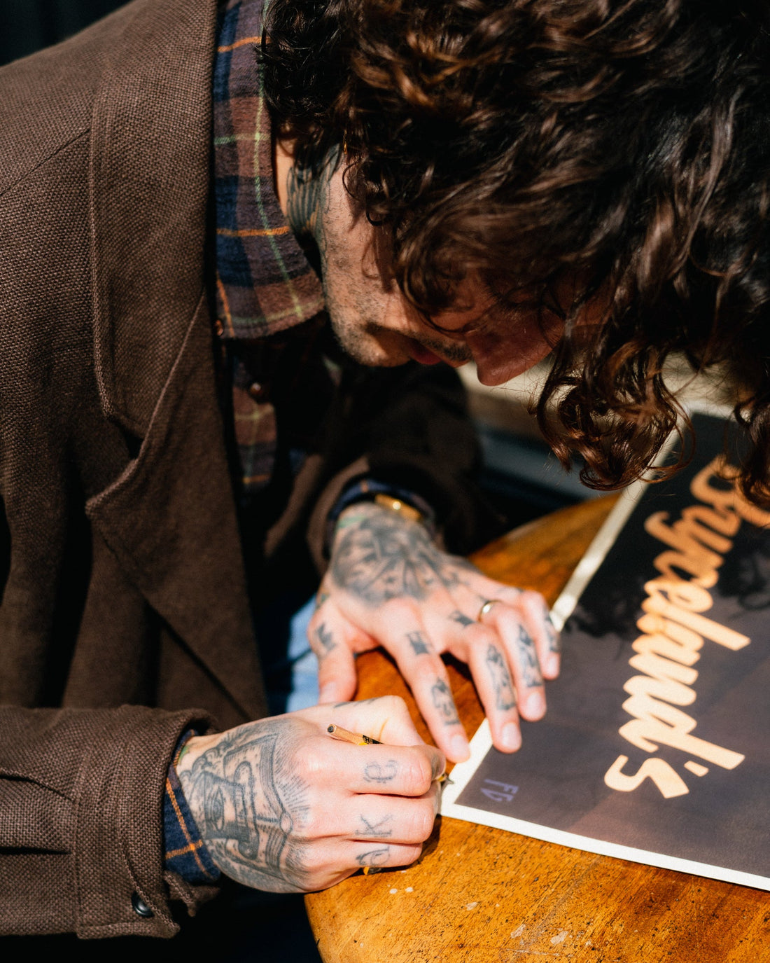
For the opening of the London store, we commissioned Fab to create an original artwork for the store.
First introduced to him during a Permanent Style pop-up at the Service, both Kenji & Ethan instantly resonated with the style and content of the art; bold block colours, and art deco style, whose vibrant eye-catching design captivates the audience.
During the commission for Bryceland's, Kenji began working with Fab on a piece for his home, a beautiful painting for his family representing his three daughters at twilight, lanterns in hand running home after a day playing in the forest. The context is reminiscent of Enid Blyton's stories, with a touch of mystic fairytale.
Kenji: When I like an artist, their work and overall style has to speak to me, and continue to do so. Fab's work draws me back with a story, something untold. He is a very talented, but humble guy, who naturally has great taste; his colour pallet and style made me want to commission a piece which I would hang at home and enjoy every day.
Fab's artwork and commissions are influenced and inspired by European & North American commercial artwork of the 1920s to 50s…
“ Going beyond nostalgia and pastiche, I work with the same spirit and sensibilities of the graphic masters of that golden age.
I paint my hand, using a technique, which I developed to echo the beauty of lithographic print, the medium by which most art and design was viewed by the public in those days.”
Before the launch, we asked him to write a little piece to talk us through his creative process, as well as working with Bryceland's.
“You're the artist.” - That was the phrase Ethan and Kenji would always use. I would ask what they thought about this or that idea for the Bryceland's poster, and they'd say, “You're the artist.” It was their way of saying, we trust you. And they mean what they say—which may be what I like about them the most.
What else do I like about them?
They live Bryceland's, they are Bryceland's. When you meet them, you meet the clothes and the shops. You shake hands with the interviews, and talk with the blog posts. And as I've got to know them, there have been no surprises—other than how infinitely warmer they are than they may, at first, appear.
I'd long wanted to explore a different atmosphere in my work. Something more serious, a little darker; less of the spotless gentleman and more of the rough-and-tumble adventurer.
With the London store opening, and plenty of wallspace to play with, I was fortunate that Kenji and Ethan could find a use for me.
So, to the poster.
Somewhere in the back of my mind, I already had an idea of what the design might be. Often in starting a new project there is a period where I must wait, knowing that eventually the concept will pop into my head. But, this time, all I needed was one night's sleep.
From the start, I saw the man you see now in the final poster, in black & white, caught in this moment of high tension. I knew it was the right image; yet something was off. The image in my head was too neat, too evocative of something in particular: Film Noir. Whilst that iconic genre's visual language suits me and Bryceland's well, I have always been keen to avoid pastiche.
To avoid the design being on-the-nose, I realised we needed some colour.
I began mocking-up versions with blues and oranges, purples and browns. The poster was looking good, but not quite Bryceland's. I went through the company's visual language again, everything they had published. I took note of the collective colours that built in my mind. Somehow, I kept coming back to sepia. Tones of warm sienna and umber seemed a perfect way to add colour but keep the design muted and moody.
But I must always keep one thing in mind: this is a poster, and its first job is to grab your attention. A select pop of brightness, here and there, should set everything off well.
So, (without giving away too many of my tricks...) let's look at the design. We have a cigarette, rendered in pale yellow. It points directly down to the phone, a key part of the scene, creating a narrative direction for your eyes. The “motion” lines around the ringing receiver are the same colour and shape as the cigarette. Accenting the pale yellow, the other pop of colour is the muted orange used for the text and the glow from the lighter. It takes up a larger percentage of the design, and so, for balance, it is dimmer in colour. Again, I use the top-down narrative direction here: we start with the slogan at the top, this time a question, before leading the eye down once more to the answer at the bottom (and the most important element of the poster): the company name.
A contrasting steely blue is employed for the dim light shooting through the blinds, and for the man's crumpled shirt.
It may be of interest to know that the original concept featured a smartphone. It was glowing as it rang, and a large question mark on the screen showed that it was an unkown caller. My aim here was to bring the poster into the modern day, something I increasingly try to do with all my work as I don't wish for my designs to blend in completely with the art of the past. It was perhaps a little jarring, and in the end we went with a mid-century phone, which I think works well; though part of me would like to see a final version with the smartphone.
As for the moment captured in the poster, I would only say that I always aim to show people in the middle of something, rather than in a pose for the camera. Such photos and illustrations never interest me. Posts of men standing-somewhere-wearing-something on social media, I confess, exhausted me long ago.
Because, what comes to my mind when I think of well-dressed people? Elegant people? Cool people? Exciting, daring, intelligent, warm people?
I think of the way they dance, or move through a room, how unaware they may be of themselves, the way they hold a cigarette, how they handle attention, run a hand through their hair, let their loafer dangle from the toe of a crossed leg, how they hold a book, the way they look at me as they eat, what they say.
In short: what they are actually doing whilst they happen to be wearing their clothes. Bryceland's, to me, and probably to you, has always been about clothes with a purpose, clothes made to be used and used a lot. I hope, then, that my poster has honoured this, and earned its place on their wall.
- Fab Gorjain
We will be displaying some of Fab's Pieces in store this weekend during our Red Rabbit Pop-up, as well as offering our limited edition and numbered prints of “Ready?”


